Wedding Venue Website Redesign: 12 Signs It’s Time
A wedding venue website doesn’t need redesigning because it’s old.
It needs redesigning when there’s a growing mismatch between the website and the business it’s supposed to sell.
That distinction matters.
A five-year-old website can still be doing its job perfectly well. A beautiful website launched two years ago can already be holding a venue back.
The question isn’t “Does our website look dated?”… It’s whether the website still represents the venue accurately, attracts the right couples, supports your pricing and marketing, and gives people what they need to decide your venue is worth seeing.
Here are 12 signs it might not.
1. Your Venue Is Better in Person Than It Looks Online
Couples visit and say: “Wow. The photos really don’t do it justice.”
It sounds like a compliment but it isn’t necessarily one.
Before couples can be impressed by your venue in person, they have to decide it’s worth visiting. If the website makes the property feel smaller, cheaper, less interesting or less polished than it actually is, some couples will never get far enough to discover the difference.
This happens particularly easily when the venue has evolved but the website hasn’t. The landscaping has matured. The interiors have been renovated. You’ve improved the ceremony space, added accommodation or completely changed how weddings flow through the property.
But online, you’re still selling the 2021 version.
Your website doesn’t have to recreate the experience of being there. It does need to make people want to experience it.
2. Your Prices Have Gone Up, but Your Website Hasn’t Caught Up
Perhaps weddings at your venue started at $6,000 five years ago and now regularly cost $15,000.
That change usually happened for a reason.
You improved the property. Added services. Built a stronger team. Invested in landscaping. Introduced better catering. Upgraded accommodation. Became more established. Or simply realized the venue was underpriced.
But does the website communicate the difference?
If your pricing has moved upmarket while your website still feels like the business you were several years ago, couples can experience sticker shock when they finally see the numbers.
The issue isn’t necessarily that you're too expensive. They haven't been given enough reasons to understand why you're worth that much. A higher price point often requires a different sales conversation — and your website is part of that conversation.
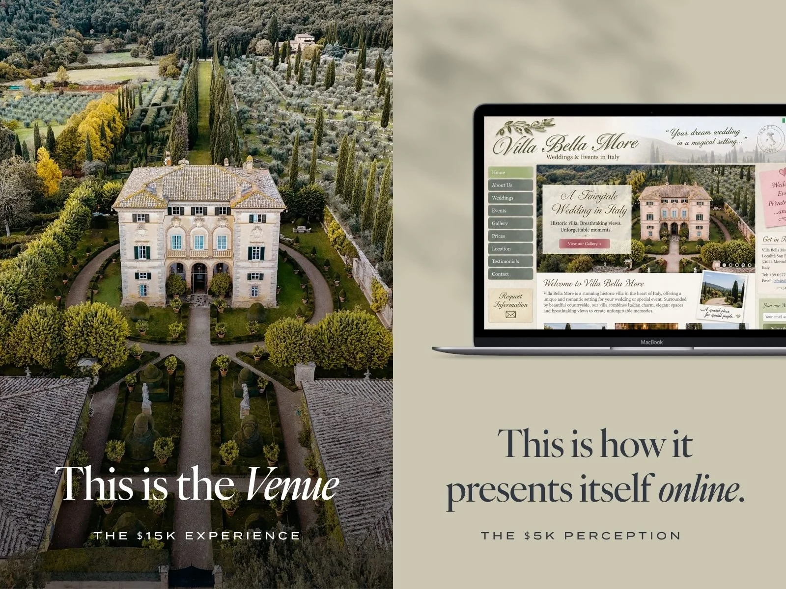
Same venue. Different perceived value.
And yes, a redesign can affect more than conversion. I recently investigated a venue whose search visibility changed dramatically after rebuilding its website.
3. The Business Has Changed, but the Website Hasn’t
Wedding venues rarely stay exactly the same.
You add a second ceremony location. Build a getting-ready suite. Start offering weekend weddings. Add accommodation. Change caterers. Introduce new packages. Stop offering something that was once central to the business.
Sometimes the change is less physical. Maybe you've moved from high-volume weddings toward fewer, higher-value events. You want more destination couples. You no longer want to compete on price. You’ve discovered that a particular kind of couple is an exceptionally good fit.
Meanwhile, your website is still structured around the old business. At some point, adding another paragraph or squeezing another page into the navigation stops working. The website needs to be rebuilt around what you're actually selling now.
4. You’re Attracting the Wrong Couples
A website can generate inquiries and still be doing a poor job. If most of those inquiries come from couples who can't afford the venue, want a wedding style you don't offer, need a capacity you can't accommodate or have completely different expectations about the experience, the problem isn't simply lead volume. It's lead quality.
Your website should do some filtering before someone reaches your inbox. Photography, copy, pricing cues, positioning and the information you choose to emphasize all tell people: This is for us. Or: Probably not.
Trying to appeal to everyone can feel safer, but it often produces more work for your sales team and fewer genuinely useful inquiries. The goal isn't the maximum possible number of leads. It's more of the right ones.
5. You’re Getting Traffic, but Not Enough Inquiries
If almost nobody visits your website, redesigning it won't magically create demand. You may have a visibility problem instead.
But if couples are reaching the site and very few take the next step, that's different.
Look at what happens after they arrive.
Can they immediately understand what kind of venue this is? Can they find the information they need? Do they explore the property or leave after one page? Does the site give them a compelling reason to keep going? Is the inquiry process easy?
More traffic isn't always the answer. Sometimes you're already getting attention. The website just isn't doing enough with it. I've written in much more detail about this in my guide to wedding venue website design and conversion.
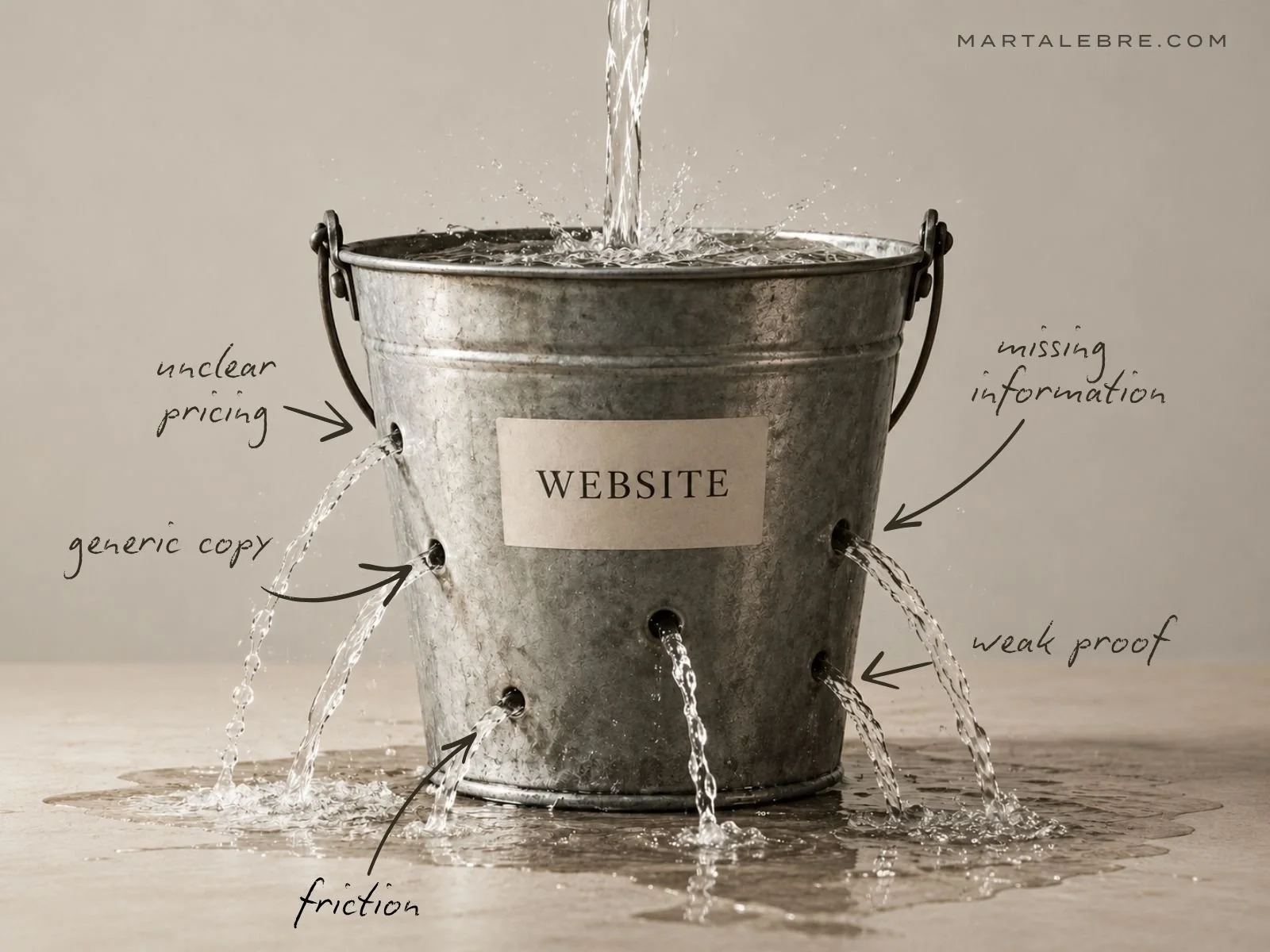
More traffic just pours more potential customers into the same leaks.
6. You’re Getting Inquiries, but Too Many Are a Bad Fit
This is different from attracting the wrong audience generally.
Sometimes the website simply doesn't pre-qualify people. You get plenty of inquiries, but half of them disappear as soon as they receive the pricing guide. Or they're looking for dates you don't offer, guest counts you can't accommodate, packages you don't have or services they assumed were included.
Your team then spends time answering inquiries that were never realistically going to become bookings. Some of that is inevitable. But if the same mismatch happens repeatedly, ask what the website could have communicated earlier. You don't necessarily need to publish every price, restriction or policy. You do need to give couples enough context to understand what kind of purchase they're considering.
A smaller number of well-qualified inquiries can be far more valuable than a crowded inbox.
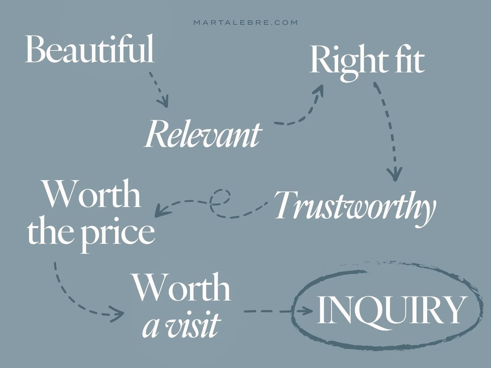
What actually happens before inquiry
7. Couples Keep Asking Questions Your Website Should Answer
Your inbox is one of the best sources of website research you have.
If couples repeatedly ask: How many guests can we have? What happens if it rains? Can we have both the ceremony and reception there? Is accommodation included? Can we choose our own caterer? What's included in the venue fee? …then look at the website before assuming couples simply don't read.
Perhaps the information isn't there. Perhaps it's technically there but buried. Or perhaps the answer is written so vaguely that people still aren't sure what it means.
Frequently asked questions reveal uncertainty in the buying process. Your website won't eliminate every question — nor should it. But it should answer the recurring ones that couples need before they can decide whether to pursue the venue.
8. Couples Can’t Tell Why They Should Choose You Over Another Venue
Wedding venue websites have developed their own language: Timeless elegance. Breathtaking surroundings. Unforgettable celebrations. The perfect setting for your special day.
Remove the logo and half the industry could be talking about the same property. This becomes a problem because couples aren't evaluating your venue in isolation. They may have twelve tabs open. If several venues are beautiful, conveniently located and within budget, what makes yours the one they remember?
It doesn't have to be some revolutionary brand concept. Maybe you have exceptional food. Maybe couples get the property for an entire weekend. Maybe your rain plan is genuinely beautiful. Maybe guests can stay onsite. Maybe the owners personally run every wedding. Maybe the venue is extraordinarily flexible.
The important part is that the website makes the difference specific. If your current site communicates the category better than it communicates your venue, a visual refresh won't solve the underlying problem.
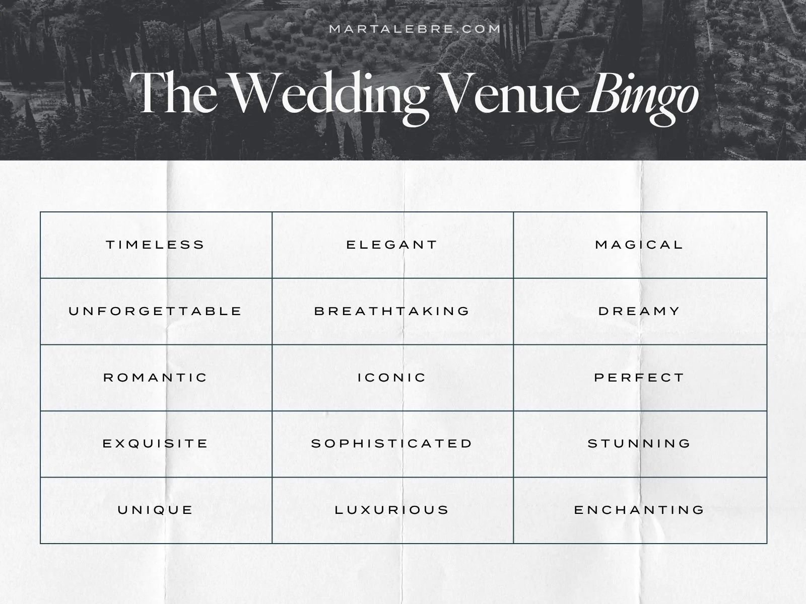
How many can you find on your website?
9. Your Website Has Become a Patchwork of Years of Additions
This happens to perfectly good websites. Someone adds a new package. Then a new page for accommodation. Then another gallery. Then a banner announcing something temporary that becomes permanent. Pricing gets updated in one place but not another. An old package still appears three clicks deep. Two pages explain the same thing differently. Buttons go wherever made sense at the time they were added.
Nothing is dramatically broken. The website has simply accumulated.
Eventually, the navigation reflects the history of the website rather than the way a new visitor needs to understand the business. That's often when a redesign makes more sense than another round of tweaks because it needs a coherent structure again.
10. Your Website Doesn’t Support Your SEO and Marketing Anymore
Your marketing strategy may have changed substantially since the website was built. Perhaps you're investing in wedding venue SEO. Running Google Ads. Creating Pinterest content. Getting more press. Targeting destination weddings. Building relationships with planners. Trying to rank for specific locations or types of weddings.
But every campaign ultimately sends people to the same generic homepage.
Or you discover that there isn't an appropriate page to rank for an important search.
Or adding useful content to the current website is so awkward that nobody does it.
Your website is marketing infrastructure. It should give different types of visitors a useful place to land and give search engines enough context to understand what you offer, where you are and why the site is relevant.
And if organic search matters to your venue, don't redesign first and think about SEO afterwards. Existing rankings, URLs, content, internal links and redirects need to be considered as part of the redesign itself.
I've covered the search side separately in my wedding venue SEO guide.
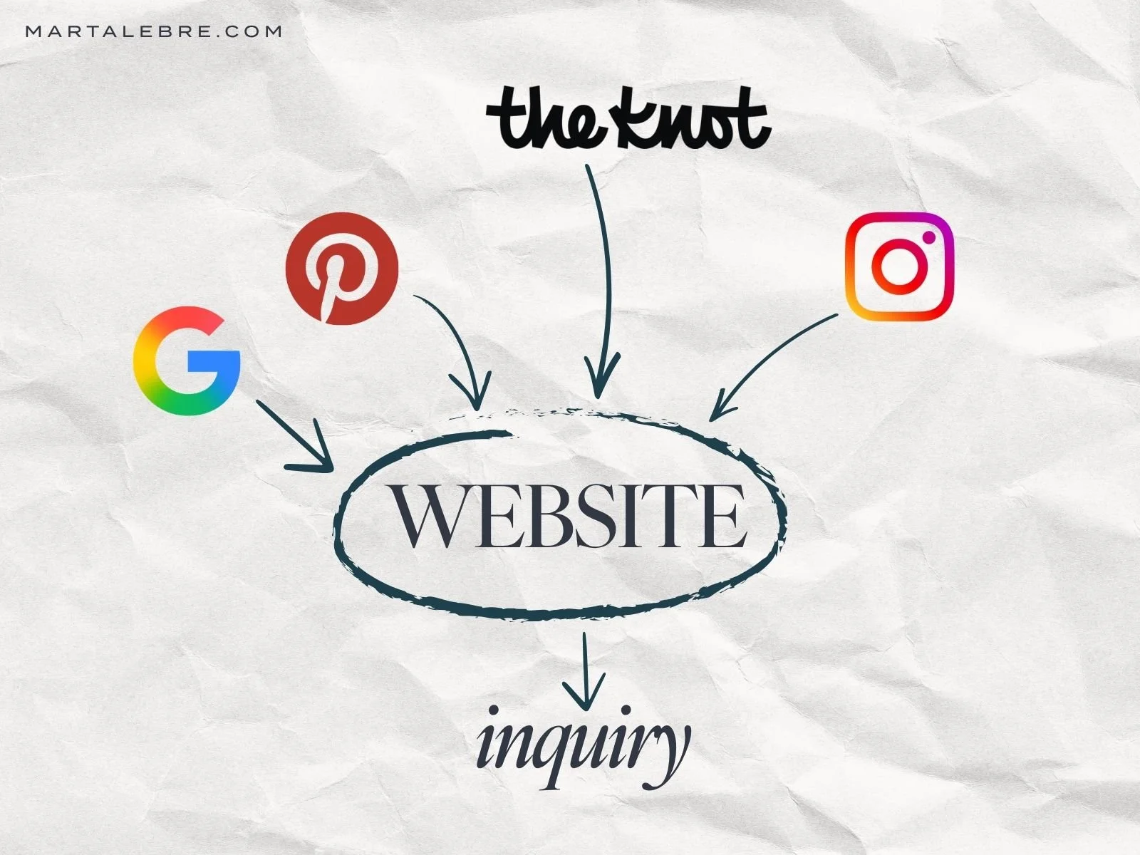
Google, Pinterest, Instagram and wedding directories can send you traffic. None of them can fix what happens after the click.
11. Your Mobile Experience Makes Researching the Venue Harder Than It Should Be
A website can technically be mobile responsive and still be awful to use on a phone. Giant images take over the screen. Galleries become endless. Important text disappears between visual sections. Pop-ups obscure content. Buttons are difficult to find. The inquiry form feels like a tax return.
And wedding venue research is particularly likely to move between devices.
Someone finds you on Instagram. Opens your website on their phone. Sends the link to their partner. Comes back later on a laptop. Sends it to their mother. Opens it again while discussing venues over dinner.
Your mobile website doesn't need to be a reduced version of the desktop design. It needs to support that research process.
Try using your website on your phone without thinking like the person who owns it. Can you quickly figure out:
Where is the venue?
What does it look like?
How many people does it hold?
Roughly what does it cost?
What makes it different?
What should I do if I'm interested?
If those answers are obvious on your laptop but exhausting on a phone, you have a problem.
12. You Hesitate Before Sending Someone Your Website
A planner asks for your website and you immediately add: “We're actually planning to redo it soon.” A photographer tags the venue and you'd rather they sent people to Instagram. You launch a new package but hesitate to promote it because the website doesn't really support it. Or you keep putting off marketing because you want to “sort the website out first.”
Being bored with your website isn't enough reason to redesign it. Neither is seeing a competitor launch something prettier.
But ask yourself why you don't feel confident sending people there.
If the answer is:
It doesn't reflect the venue anymore.
It makes us look cheaper than we are.
It attracts the wrong clients.
It's difficult to use.
It doesn't explain what makes us different.
It isn't helping us sell what we're trying to sell.
…then the problem isn't that you've looked at the same homepage too many times.
The website and the business have drifted apart.
Before You Redesign Your Wedding Venue Website
Don't start by choosing a new template. Start by figuring out why the existing website isn't doing its job anymore.
Look at your analytics. Look at the inquiries you receive — including the bad ones. Read reviews and notice what couples praise after they've actually experienced the venue. Write down the questions your team answers over and over again. Look at what has changed in the business since the current website was built.
Then compare that reality with what someone sees online.
You may discover you don't need a complete wedding venue website redesign at all.
Maybe you need better photography.
Maybe the information architecture needs cleaning up.
Maybe your pricing needs more context.
Maybe your positioning and copy are the real problem.
Maybe your website is perfectly good and you need more people to find it.
Redesigning a website that doesn't have a design problem is an expensive way to avoid diagnosing the actual problem.
What Should a Wedding Venue Website Redesign Actually Fix?
If a redesign is warranted, I wouldn't measure its success by how dramatically different the new homepage looks.
It should close the gap between the venue you operate and the venue people perceive online.
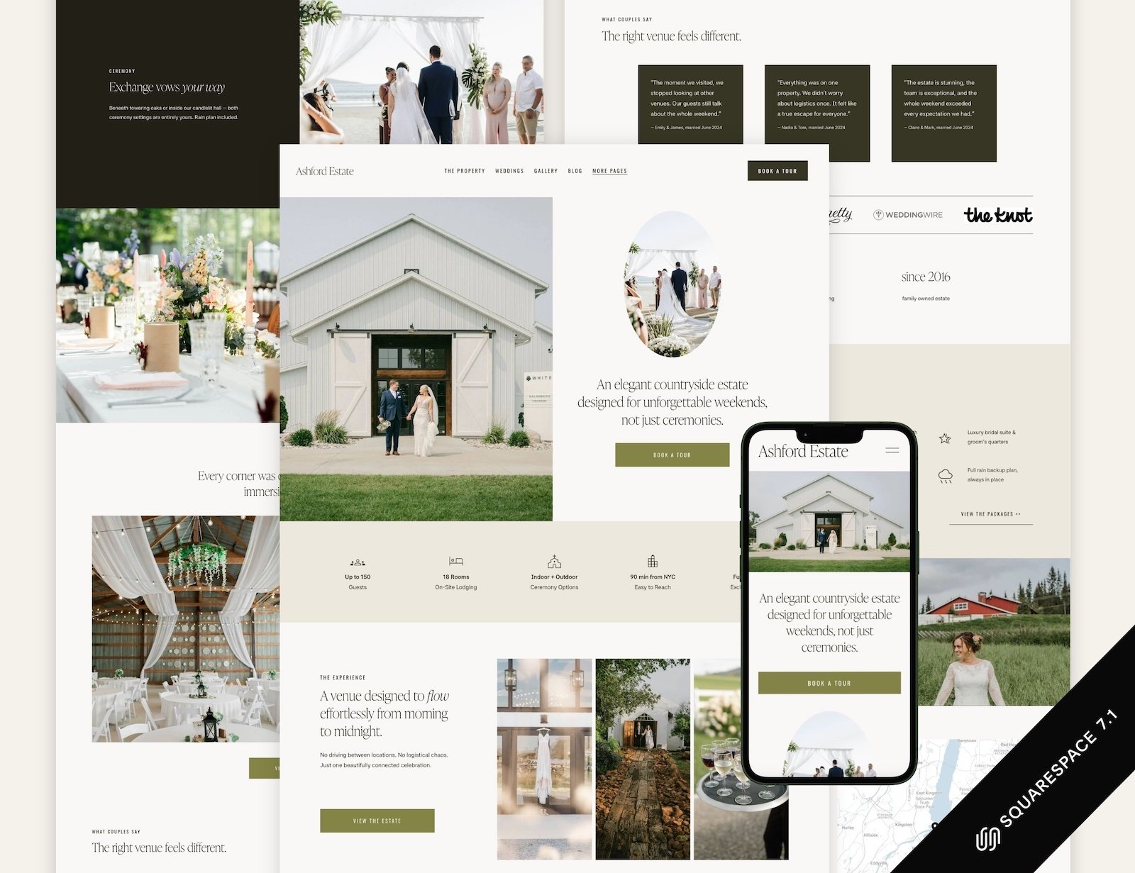
It should make the right couples understand the offer faster. Make the price make sense. Answer the questions that matter. Show why you're different. Make researching the venue easier. Support your SEO and marketing. And give people enough confidence to take the next step.
Because the goal of a wedding venue website isn't “OMG, what a beautiful website.” It's: “We need to see this place.”
That's how I approach wedding venue website design: starting with the business, the market and how couples actually choose — then designing the website around the decision it needs to support.
Interested in wedding venue marketing? Read more…