7 Things Couples Try to Find in 30 Seconds on a Wedding Venue Website
Couples don't browse wedding venue websites. They scan them.
Usually late at night, on their phone, with four other venue tabs already open. They're moving fast, and somewhere in the first thirty seconds, a quiet decision gets made: shortlist, or keep looking.
Most venues underestimate how quickly this happens.
By the time someone lands on your site, they're not discovering you — they've probably already seen your photos on Instagram, your listing on The Knot, maybe even heard your name from a friend. Your website isn't the introduction. It's the final filter. And their brain is running through a very specific checklist, whether they realize it or not.
Here's what they're actually looking for.
What Couples Look For on a Wedding Venue Website (That Drives Bookings)
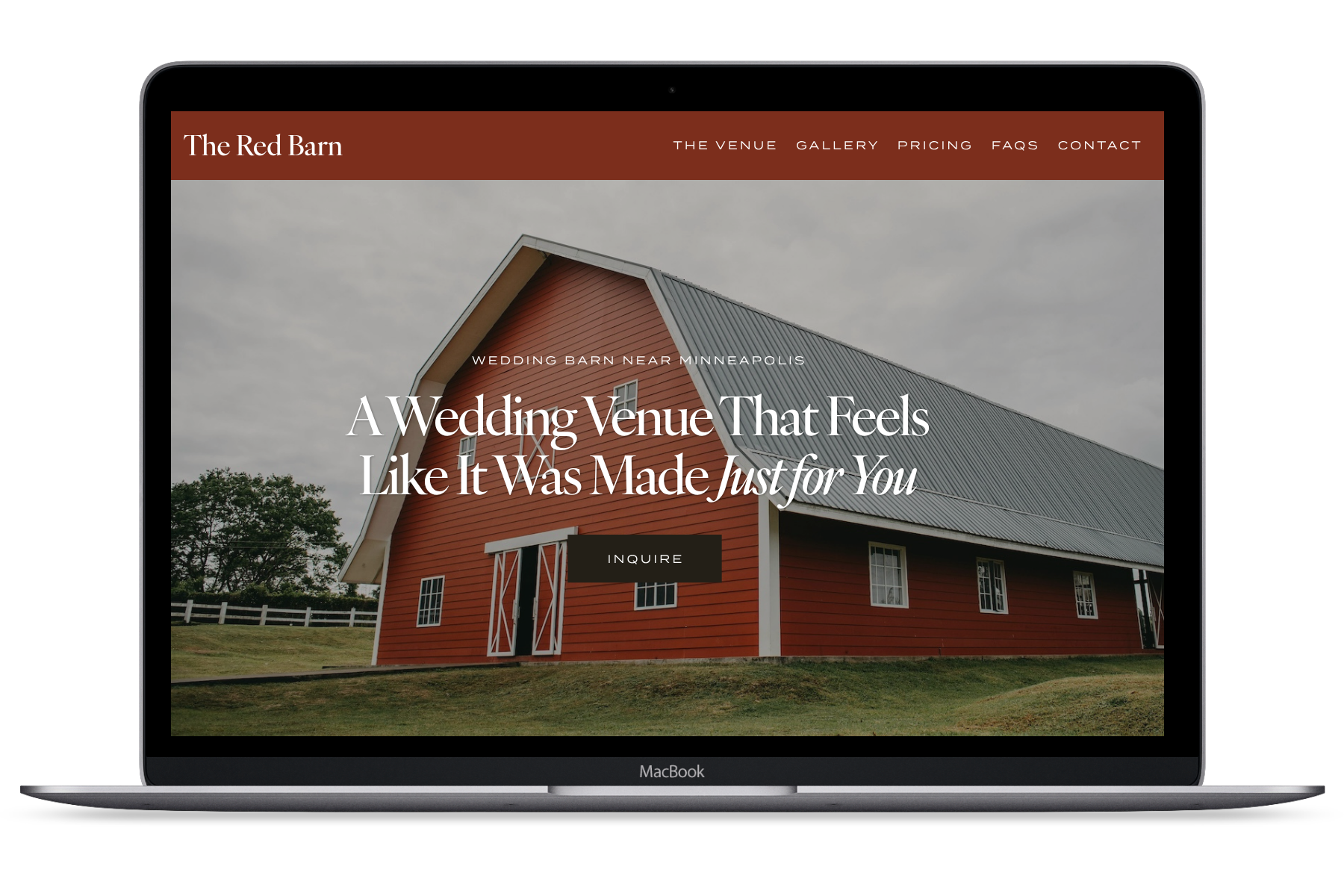
1. What does this place actually look like?
Not a styled shoot. Not a close-up of someone's ring. The venue — the ceremony space, the reception layout, the overall feel of the place. They're trying to answer one question: can I picture our wedding here?
If your homepage opens with a slow-loading slider, heavy overlays, or images that are cropped so tight you can't tell what you're looking at, it creates friction. And friction at that stage usually means they're gone before they've even given you a real chance.
2. Does it fit our guest count?
This is a fast yes/no filter, and couples won't go digging for the answer. If they can't quickly find your capacity, whether the space works for indoor or outdoor events, and how flexible the setup is — they'll assume it doesn't work for them and move on. It's not that they're being impatient. They're just comparing a lot of venues at once, and the ones that make it easy to answer basic questions get to stay in the running.
3. Is it somewhere in our price range?
This is where a lot of venues quietly lose people — and it's usually not about the price itself. It's about the uncertainty.
Couples aren't necessarily expecting a full pricing breakdown. But they do need some kind of orientation. A starting price, a package range, even something like "most couples spend between X and Y" goes a long way. Without it, they're guessing. And when people are guessing, they hesitate. And when they hesitate, they move on.
4. What’s included — and what isn’t?
There's a mental load that comes with planning a wedding, and couples are very aware of it. When they're looking at your site, they're trying to figure out: what's already taken care of, what they'd need to organize themselves, and how complicated this whole thing is going to feel.
If your website leaves that unclear, their brain fills in the gaps — usually with worst-case scenarios. "Is this going to be a lot of work? Are there a lot of hidden costs?" That doubt alone is often enough to make them click away.
5. What does the experience actually feel like?
This one is harder to pin down, but it's always happening.
Couples are picking up on tone, atmosphere, and the general sense of care that comes through on a website — not through long paragraphs of text, but through images, layout, and how easy (or exhausting) the site feels to use. If it comes across as cluttered, outdated, or inconsistent, it raises a quiet question in the back of their mind: will the actual experience feel like this too?
First impressions of a website become proxies for what working with you might be like.
6. Are we the right kind of couple for this place?
This one is rarely conscious, but it's always there. They're trying to get a feel for whether this venue is formal or relaxed, intimate or large-scale, luxury or more laid-back. They want to know if they'd fit here.
When that positioning isn't clear, you end up attracting the wrong inquiries — people who aren't really your couple, who are more price-sensitive, who need a lot of back-and-forth before deciding. Clarity on your website does a lot of quiet filtering before anyone even reaches out.
7. What’s the next step?
This should be the easiest part. Often, it's not.
Instead of one clear path forward, a lot of venue websites have multiple competing buttons, vague "contact us" pages, or forms that feel like a lot of work to fill out. When someone has actually reached the point of wanting to take action, they shouldn't have to think about what to do next. It should just be obvious.
Couples aren't looking for more information. They’re looking for enough clarity to feel confident making a decision. And most wedding venue websites, without meaning to, make that harder than it needs to be.
Quick Test Worth Doing
Open your own homepage and give yourself thirty seconds. Ask honestly:
Can I clearly see the venue?
Do I know if it fits my guest count?
Do I have any sense of pricing?
Do I understand what's included?
Does this feel like it could be us?
Do I know what to do if I'm interested?
If any of those feel murky, that’s probably where you’re losing people.
Couples don't choose the venue with the most information. They choose the one that feels easiest to say yes to.
If your site is getting traffic but not enough inquiries — or it just feels like something's slightly off — I offer a focused website review for wedding venues where I walk through exactly what's happening and what's worth fixing.