The Wedding Venue Funnel Nobody Talks About
There's a version of the wedding venue funnel that most venue owners believe in: couple discovers venue, couple loves venue, couple inquires, couple books. Neat. Linear. Satisfying on a whiteboard.
The actual version looks nothing like that.
The real journey is messy, emotional, and surprisingly fragile at stages that most venue marketing never touches. Venues pour energy into inquiry forms and photography while the actual decision — to stay interested or quietly move on — is being made long before anyone clicks "contact us."
Understanding where couples are psychologically, not just what they're clicking on, changes everything about how you approach your website, your content, your Google presence, and what "a conversion" even means.
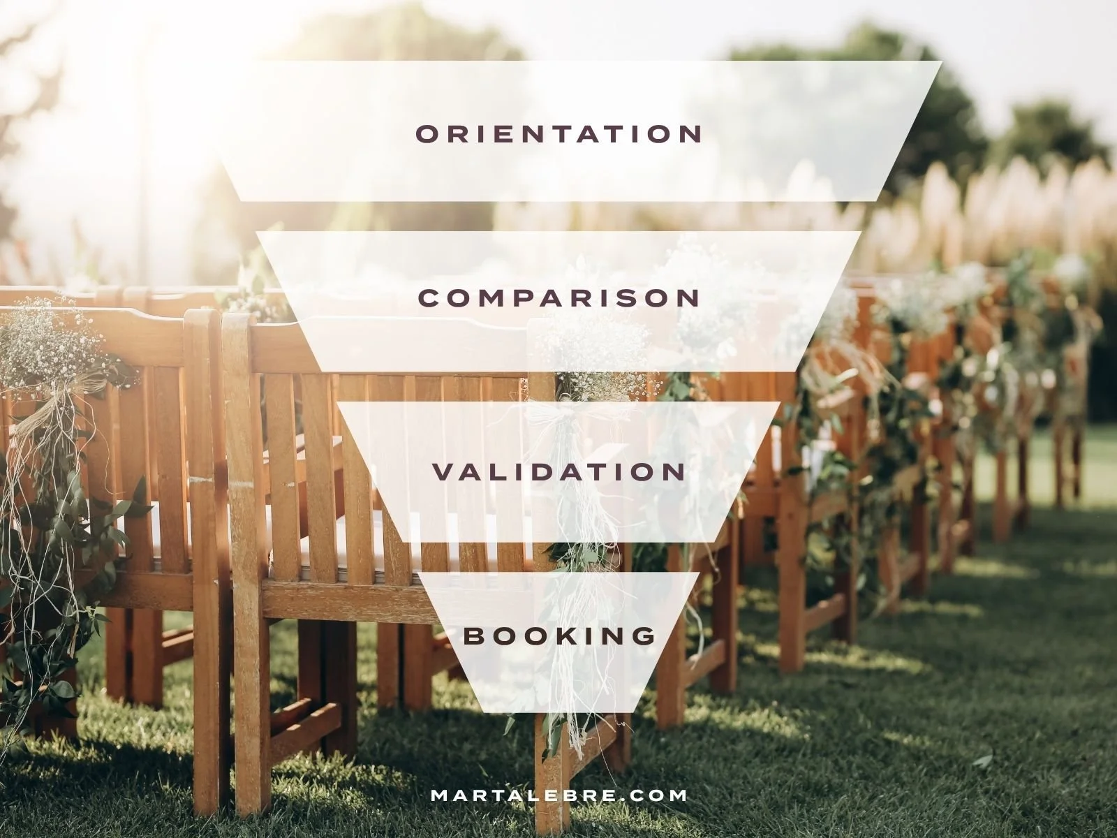
The Three Modes Couples Move Through
Couples don't search the same way throughout the planning process. They shift through three distinct psychological modes — and each one has a completely different relationship with information, trust, and patience.
MODE 01 | Orientation
This is the dreamy early phase. Often starts before the ring is even on the finger. Couples aren't ready to decide anything yet. They're building a picture of what's possible — what venues exist, what styles feel right, what their wedding could actually look like.
Pinterest boards. Instagram saves. Lots of rabbit holes at 11pm. They're absorbing atmosphere, not comparing logistics. They don't know enough to comparison shop, so they're not doing it. They're doing something more useful: developing taste.
A venue that shows up clearly and consistently in this phase earns something no ad can buy — a place in the couple's mental shortlist before they've started a formal one. You become part of their aesthetic vocabulary. That's a significant head start.
Most venues underinvest here because the ROI is invisible. There's no clean line from an Instagram save to a signed contract. But that doesn't mean the line isn't there.
MODE 02 | Active Comparison
Now things get serious. Budget vaguely established. Guest list roughly known. Geography decided. The couple is ready to make an actual list.
The psychology flips completely. Orientation was expansive — pulling ideas in. Comparison is ruthlessly contractive — cutting options out. Couples are now scanning websites for reasons to eliminate venues, not reasons to fall in love with them.
This is where the stakes for your website are highest.
In orientation mode, mood and beautiful photography carry the weight. In comparison mode, clarity and completeness become everything. Couples visiting eight venue websites on a Sunday afternoon are tired, a bit overwhelmed, and have approximately zero interest in clicking around to find your pricing or capacity. Any venue that makes them work too hard — to find basic information, understand the flow of a day, grasp what's actually included — gets quietly dropped from the list. Not rejected. Just... not pursued.
This is the phase most venue websites are least prepared for. The phase where friction does the most damage.
MODE 03 | Validation
Here's something most venues don't realise: by the time a couple sends an inquiry, they've usually already made a tentative emotional decision. The inquiry is a final check — a way to confirm what they've half-decided and settle the remaining questions the website couldn't quite answer.
The inquiry is not the beginning of the sales process. It's late in it.
Which means couples who inquire and then go quiet aren't necessarily cold. They came in mostly convinced. Something in the response — the timing, the tone, an unanswered question — introduced a doubt the website had already nearly closed. A clunky or slow reply at this stage does a lot of damage on very thin margins.
Many venues treat the inquiry as where the work begins. Most of the work has already happened without them in the room.
How Couples Actually Search
Those three modes explain a lot of search behavior that otherwise seems random.
Early-stage searches are atmospheric, not practical.
"Barn wedding venue." "Forest wedding venue." "Romantic wedding venues in the Cotswolds." These aren't logistical queries. Couples are searching for a feeling, not a floor plan.
The venues that perform well here aren't necessarily the most famous or the most expensive. They're the ones with a clear, consistent visual identity — a look, an atmosphere, a mood — that holds together across photography, website, and social media. Coherence creates recognition. Recognition creates attachment before any formal comparison even begins.
Mid-stage searches get specific and practical.
"Wedding venues for 150 guests." "Exclusive use wedding venues with accommodation." "Outdoor ceremony indoor reception venue." Now couples are searching with real constraints. They know what they need. They're filtering ruthlessly.
This is where detailed, honest, well-organised content earns its keep. Not long-winded copy, but clean specificity: actual guest capacities, ceremony options, what exclusive use genuinely includes, how a typical wedding day flows through the property. The venues that answer these questions directly on their website — rather than making people email to find out — win a disproportionate number of shortlist spots.
Every question a website can't answer is a reason to close the tab.
Late-stage searches are about confirmation.
"[Venue name] reviews." "[Venue name] real weddings." "[Venue name] vs [Other venue name]." The couple already knows who they're seriously considering. Now they want validation from people who aren't trying to sell them anything.
This is where reputation quietly closes the deal. Venues with detailed, emotionally genuine testimonials — actual words from real couples, not just four stars and a thumbs up — gain the final edge. Thin or vague reviews create a last-minute wobble that's hard to recover from, even if the venue is objectively brilliant.
The Platforms Are Not Neutral
Where a couple searches shapes what they're ready to receive. The platform and the psychological mode are closely linked.
Instagram and Pinterest are orientation environments. Couples are unhurried and emotionally open. What works here is atmospheric: light and texture and candid moments from real weddings. The goal isn't clicks. It's becoming part of how a couple imagines their day — before they've formally started looking.
Google shifts depending on the query. Broad searches ("romantic barn venues") sit in early-mode territory. Specific, constraint-heavy searches ("exclusive use wedding venue Yorkshire 120 guests") are solidly in comparison mode. Knowing which pages to build for which intent matters more than most venues realise.
AI tools — ChatGPT, Claude, Perplexity — are increasingly part of early research, and they work differently from traditional search in ways most venues haven't caught up with. A couple asking an AI for "relaxed outdoor wedding venues in the Peak District under 100 guests" gets a synthesised answer, not a list of ads. The venues that appear tend to have the clearest, most complete, most consistent online presence. AI rewards information density. Vague or thin websites don't make the cut.
Directories like Bridebook, Hitched, or The Knot are useful for discovery but have a flattening effect: every venue ends up looking roughly similar, competing mainly on price and star rating. Rely on them too heavily and you can end up trapped in a comparison loop you didn't design and can't easily win.
Supplier referrals — especially from photographers — arrive late and hit hardest. A photographer who mentions your venue during an engagement shoot is delivering a trust signal that no ad budget can replicate. It's personal, peer-level, unprompted. Venues that genuinely invest in supplier relationships benefit from a compounding effect that's invisible in their analytics and very visible in their bookings.
Where Most Venue Websites Get It Wrong
Two patterns come up constantly.
The first: building for orientation mode while failing comparison mode.
Venues invest in beautiful photography and cinematic homepage videos — then bury the guest capacity, hide the pricing, and make couples click six times to understand what a wedding day actually looks like. The website creates a mood but not a decision. For someone in orientation mode, fine. For someone in active comparison with seven other tabs open on a Sunday afternoon — an elimination.
The second: treating the homepage as the main entry point.
A couple who searches "outdoor ceremony indoor reception venue North Yorkshire" and lands on a page that directly answers that question is in a much better position than one dropped on a homepage and left to find their own way. Deep, specific content that matches specific search intent outperforms a beautifully designed homepage that treats every visitor identically.
The Certainty Problem
Underneath all of this is something no dashboard captures: emotional certainty.
A wedding venue isn't just an expensive purchase. It's an unrepeatable one. There's no do-over if it disappoints. That weight makes uncertainty feel threatening in a way it doesn't with most buying decisions. Every unanswered question — however small — plants a doubt that can quietly override a genuinely positive first impression.
The best venue websites understand this sequencing.
They let couples feel excited first.
Then they help couples confirm that excitement by answering practical questions with clarity and honesty.
They don't lead with price (too early, kills the mood).
They don't hide it either (too frustrating, creates suspicion).
They earn emotional buy-in before they ask for logical commitment.
Couples aren't searching for a venue. They're searching for certainty that a specific venue is right for them. The funnel that builds that certainty — gradually, in the right order, across the right platforms — is the one that converts.
Not because it was optimised. Because it understood what couples were actually trying to resolve.
If your venue website is doing the orientation phase beautifully and fumbling the comparison phase quietly — that's worth looking at. Let's talk.