Why Your Therapist Website Feels Off (and How to Fix It)
You open your website with fresh eyes and feel it immediately.
Nothing’s wrong, exactly — the photos are nice, the fonts are clean, the colors feel “professional.”
And yet… something inside you goes quiet.
You might even cringe a little when you share your link.
I’ve seen this pattern with almost every therapist I work with. Their sites aren’t broken — they’re simply out of alignment.
It’s the difference between a website that looks professional and one that feels like you.
A therapist’s website isn’t just digital real estate. It’s an energetic introduction — a place where safety begins before the first session.
If your website feels off, it’s not just a design issue; it’s an energetic disconnect between who you are and what’s being expressed online.
Here’s what might be happening — and how to bring your digital presence back into alignment.
1. It Looks Professional — But Feels Cold
Therapists are taught to be professional, ethical, and boundaried. But when that professionalism translates into design, it often turns into emotional distance.
Clean layouts, navy headers, and stock photos of smiling couples might look safe, but they rarely feel human.
Your future clients don’t need a corporate brochure — they need to feel the warmth, calm, and authenticity that define your sessions.
How to Fix It:
Show presence, not perfection. Use real photography of your space or hands mid-gesture instead of generic imagery.
Infuse softness into design. Choose colors that invite exhale — muted sage, soft beige, gentle blush — and pair them with round shapes and white space.
Write as if you’re speaking to one client. Drop clinical tone for conversational language: “You deserve to feel at home in your own body.”
These choices create emotional safety — and trust starts long before your client clicks “Book.”
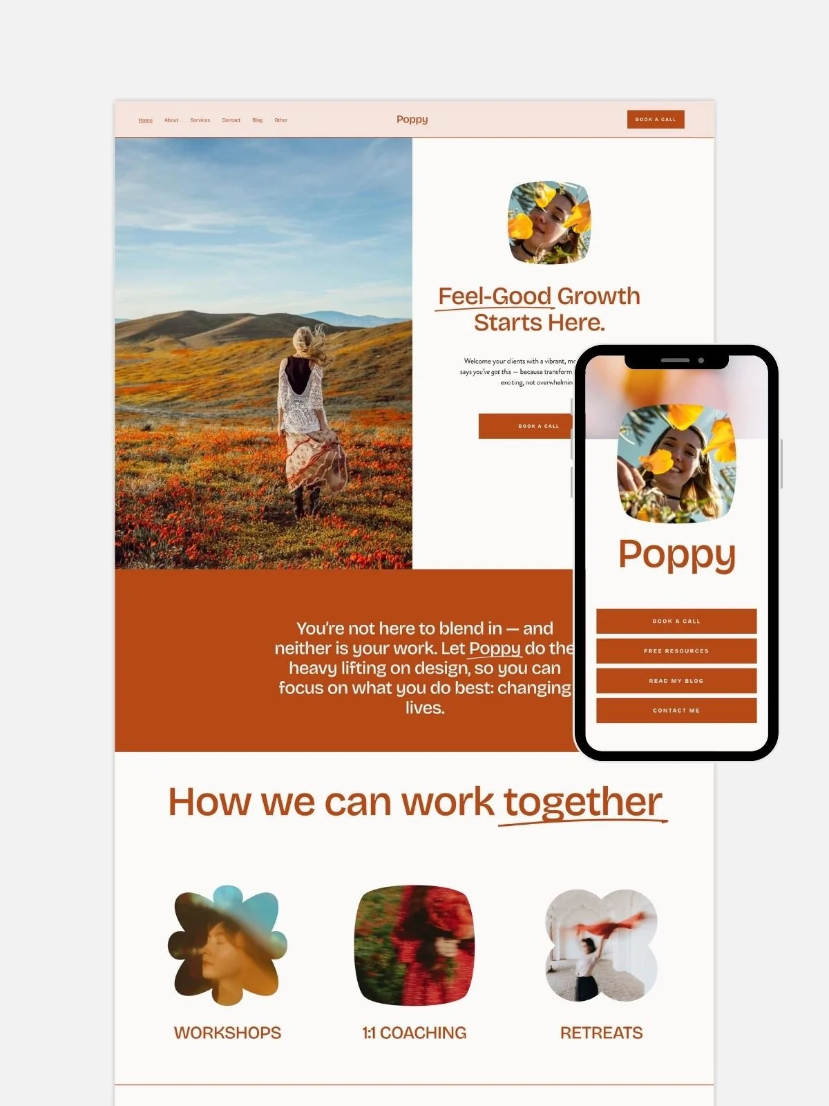
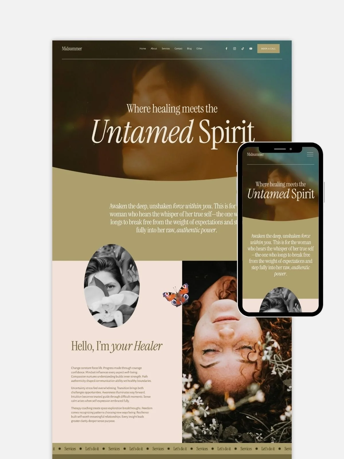
💡 Aurora, my therapist-focused Squarespace template, was designed for this exact feeling: slow rhythm, organic spacing, and soft typography that instantly soothes the nervous system.
2. Your Messaging Sounds Generic
Most therapists freeze at the blank page. So they default to “I help people overcome anxiety, depression, and stress.”
But every other therapist says the same.
The result? You blend into a sea of sameness.
Generic messaging doesn’t build connection — it creates confusion. Visitors don’t know what makes you different, and your unique energy never comes through.
How to Fix It:
Mirror your clients’ actual words. If they say “I can’t turn my mind off at night,” use that phrasing.
Show your special focus. “I work with adults navigating relationship anxiety and emotional burnout” is infinitely clearer than “I help people heal.”
Weave in your tone and worldview. You can be grounded, spiritual, scientific, poetic — just be consistent.
Your clients choose you not because you’re the most qualified therapist — but because your presence feels safe.
Let that energy translate into your copy.
3. No One Can Find You (a.k.a. Missing SEO)
The sad truth: even the most beautiful therapist websites often live in Google’s version of the Bermuda Triangle.
If you’ve never done SEO setup, your clients may not even know you exist online.
Therapists usually rely on word-of-mouth or Psychology Today, but your website could easily bring in steady organic referrals — if optimized correctly.
How to Fix It:
Add your location and specialization to headings and text (e.g., “online trauma therapy in Warsaw” or “anxiety therapist for expats in Berlin”).
Write specific page titles and meta descriptions for each page in Squarespace.
Use alt text for images describing what’s in them (“woman journaling in therapy notebook,” not “IMG_5432”).
Submit your sitemap to Google Search Console to ensure your site is indexed.
You don’t have to become an SEO expert — just make sure your site is searchable.

4. The Layout Doesn’t Guide the Visitor
I often see therapist sites that feel like a maze — long paragraphs, disconnected sections, and buttons leading everywhere (and nowhere).
When visitors can’t quickly understand what you do or how to reach you, they quietly leave.
Your website’s flow should mimic a safe therapy session: calm pacing, gentle guidance, clear next steps.
How to Fix It:
Start with a welcoming hero section. One sentence that says who you help and how.
“Helping sensitive adults rebuild trust in themselves and others.”
Follow with clarity: your approach, your services, your credentials, then your CTA.
Keep navigation minimal. Limit the menu to Home, About, Services, Blog, Contact.
Design for mobile first. Most therapy clients find you on their phone — make every section scroll smoothly.
When a layout feels calm and predictable, your visitor’s nervous system relaxes. That’s where trust — and conversions — happen.
5. The Energy Is Misaligned
This is the part most designers don’t talk about — but therapists immediately understand.
Sometimes a website feels off not because of the design, but because it was created during an old version of you.
Maybe you built it at the start of your practice, when you were still figuring out your niche.
Maybe it was created in a season of survival — after burnout, maternity leave, or a big life change.
Or maybe a designer built it with their aesthetic, not yours.
Either way, the site no longer reflects who you are now.
How to Fix It:
Take a moment to look at your site as a visitor.
Ask yourself:
Does this reflect the energy I hold in session?
Does it sound like my current voice?
Does it feel light, grounded, and safe — or heavy and outdated?
If it feels misaligned, you don’t need to scrap it all. Sometimes small shifts — new images, updated colors, refreshed copy — can completely transform the energy.
My Aurora and Poppy (coming soon!) Squarespace templates were built with this intention: simple to customize, energetically grounded, and designed to help you reconnect with your current frequency — not the version of you from three years ago.

Therapist Website Alignment Checklist
A quick self-audit:
☐ My website sounds like me, not a generic practice description.
☐ It feels warm, safe, and human — not cold or corporate.
☐ Visitors instantly understand who I help and how.
☐ It guides them toward one clear next step (booking or contacting).
☐ It’s SEO-optimized and works beautifully on mobile.
☐ I feel proud and peaceful when I share it.
If you checked no to more than one, that’s not a sign of failure — it’s simply time for a refresh.
Websites, like people, evolve.
From “Off” to Aligned…
When a therapist website feels off, it’s usually a mirror.
It’s reflecting the gap between where you were and where you are now.
That’s not a problem — it’s an invitation.
Your website can be a living, breathing reflection of your work: clear, calm, safe, and quietly powerful.
When it’s aligned, clients feel that resonance instantly. They don’t just read your words — they feel your presence.
If you’re ready to bring your online presence back into energetic and strategic alignment, I’d love to help.
👉 Explore Aurora — Squarespace Template for Therapists
👉 or Work With Me 1:1