10 Color Palettes to Inspire Your Vacation Rental Brand Design
When travelers scroll through dozens of listings or vacation rental websites, what stops them in their tracks?
Emotion. Story. Vibe.
And your brand is what delivers that vibe—before they even read a word.
When it comes to vacation rentals, your brand colors are powerful booking drivers that can make or break your property's success, not merely aesthetic choices.
Whether you're managing a cozy mountain cabin or a luxury beachfront villa, the right color palette creates an emotional connection with potential guests before they even step foot on your property. I've analyzed hundreds of top-performing vacation rental brands, and the results might surprise you. The most successful properties don't just randomly pick pretty colors—they strategically choose palettes that evoke specific emotions and build instant trust.
Your brand colors appear everywhere: from your listing photos and website to your social media presence and welcome materials. Get this wrong, and you'll blend into the sea of generic rentals. Get it right, and you'll create a memorable brand that guests actively seek out and recommend to others!

1. Nordic Coastal Charm
This palette is equal parts rustic and refined. The warm rust-orange adds soul and character, while the icy neutrals and steely sea blues evoke a windswept coastline.
Think driftwood textures, wool blankets, and quiet sunsets over chilly waters.
Perfect for: Scandinavian-inspired cabins, minimalist beach houses, or rugged island escapes.

2. Earthy Tidepools
Inspired by rock pools at dawn, this palette blends soft greys, sandy taupes, and earthy browns with a hint of morning mist. It's grounded and elegant, perfect for spaces that celebrate texture and natural materials.
Picture handmade ceramics, polished concrete floors, and linen curtains swaying in a sea breeze.
Perfect for: Eco-retreats, design-forward desert homes, or boutique stays in coastal nature reserves.

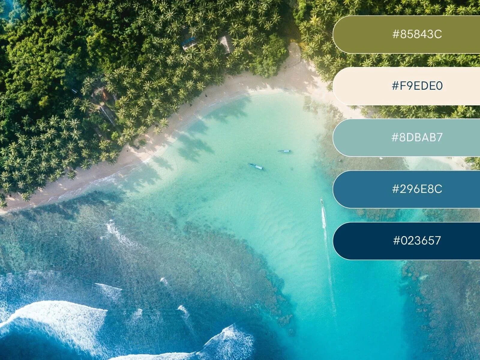
3. Tropical Earth
A twist on the traditional tropical palette—more earth, less neon. Mossy greens, pale sand, and olive golds create a grounded yet lush atmosphere.
Imagine botanical prints, sustainable wood, and an outdoor shower under the palms.
Perfect for: Eco-luxury villas, island bungalows, or nature-immersed glamping experiences.

4. Foggy Forest Escape
Moody, misty, and mystical. This palette reflects the quiet drama of forest mornings, with a golden amber accent that warms up the cooler tones.
Think cozy fireplaces, hand-knitted throws, and stillness between the trees.
Perfect for: Forest cabins, yoga retreats, or off-grid mountain homes with a soulful touch.

5. Lagoon Luxe
If your rental screams “paradise found,” this palette is your soulmate. Aquatic teals, creamy sand, and vibrant jungle greens capture the luxury and adventure of a dream island escape.
Cue hammocks, tropical cocktails, and that one perfect photo of the shoreline.
Perfect for: Beachfront bungalows, surf lodges, or honeymoon-ready resorts.
6. Blush Dunes
Soft, dreamy, and ultra-feminine with a hint of depth. This palette blends pastel sands with moody marine tones, making it serene yet sophisticated.
Think sunrise yoga, flowy curtains, and coastal elegance with a gentle touch.
Perfect for: Wellness retreats, beachfront sanctuaries, or interiors with blush accents and brass details.

7. Old Town Riviera
This palette feels like a stroll through a sun-soaked Mediterranean village. Burnt peach walls, mint shutters, terracotta pots—it’s cheerful and nostalgic.
Perfect for rentals with vintage charm, European soul, and a touch of seaside flair.
Perfect for: Townhouses in Provence, Tuscan apartments, or colorful coastal escapes.

8. Surfer’s Sunrise
Vibrant, fresh, and full of movement. This blue-forward palette feels energetic but grounded, like sunrise on a surfboard.
Picture wetsuits on the line, sandy toes, and morning coffee with a sea breeze.
Perfect for: Surf camps, beachside Airbnbs, or youth-focused rentals near the waves.

9. Tuscan Grove
This palette radiates warmth, tradition, and rustic luxury. With olive green, terracotta, and aged neutrals, it feels grounded and rooted in heritage.
Olive trees swaying, terracotta tiles, golden hour over rolling hills.
Perfect for: Vineyard villas, countryside homes, or rentals that celebrate slow living and old-world charm.

10. Cinque Terre Sunset
Bold and bursting with character. This palette captures the playful architecture and colorful spirit of Italy’s coastal gems.
Picture gelato on a terrace, striped umbrellas, and sunset aperitivos.
Perfect for: Urban apartments, artistic homes, or properties in culturally rich, photogenic locations.

So, Which Palette is Yours?
Your color palette is more than a design choice—it’s your rental’s first impression. It speaks for your space long before your guests arrive.
Ask yourself:
What emotion do I want guests to feel?
What kind of story does my rental tell?
How can my colors reflect the location, values, and vibe of my brand?
Want help creating a cohesive vacation rental brand that gets you booked?
I specialize in Squarespace design and SEO for vacation rental owners who want a high-end, easy-to-manage website that actually gets found on Google.
✨ You can:
Or grab a DIY-friendly Squarespace vacation rental website template that already includes everything you need to launch fast and look professional
Let's make your rental feel like a destination—online and IRL.